Tribula
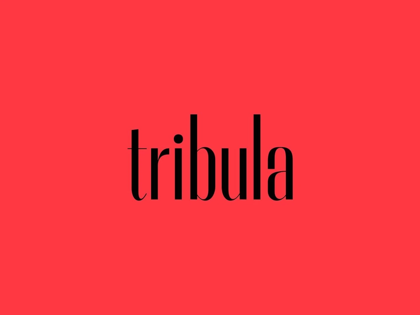
A tall, slender wordmark, a coral red and a menu in two languages: the identity of La Tribula, sushi and seafood in Merici di Gerace.
- Discipline
- Brand Identity
- Year
- Client
- La Tribula
La Tribula is a restaurant in Merici di Gerace, with a garden and a pool, that brings sushi and seafood onto the same menu. Studio Cosmos designed its identity and looked after it from 2024 to 2025.
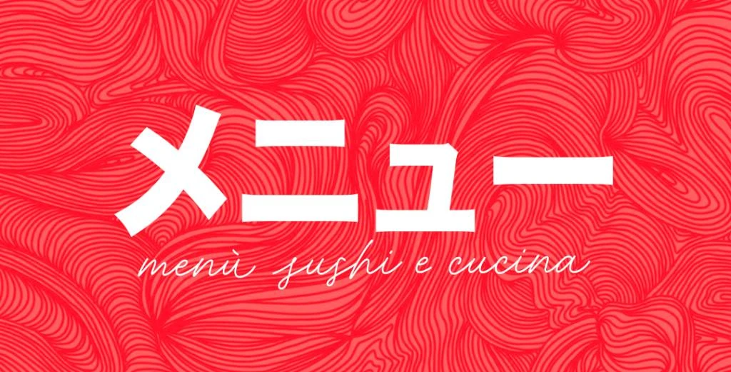
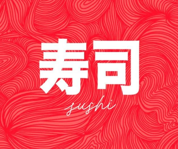
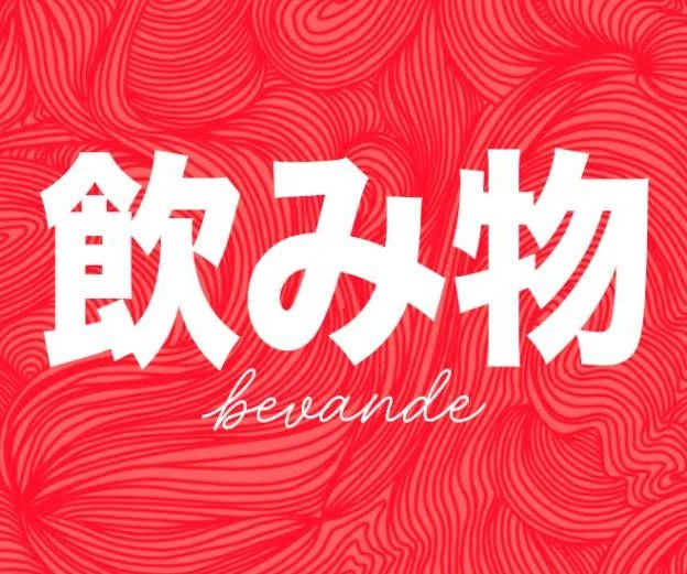
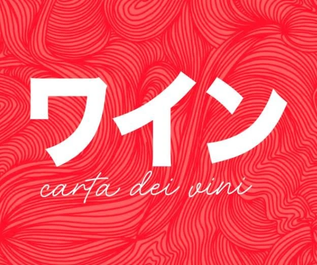
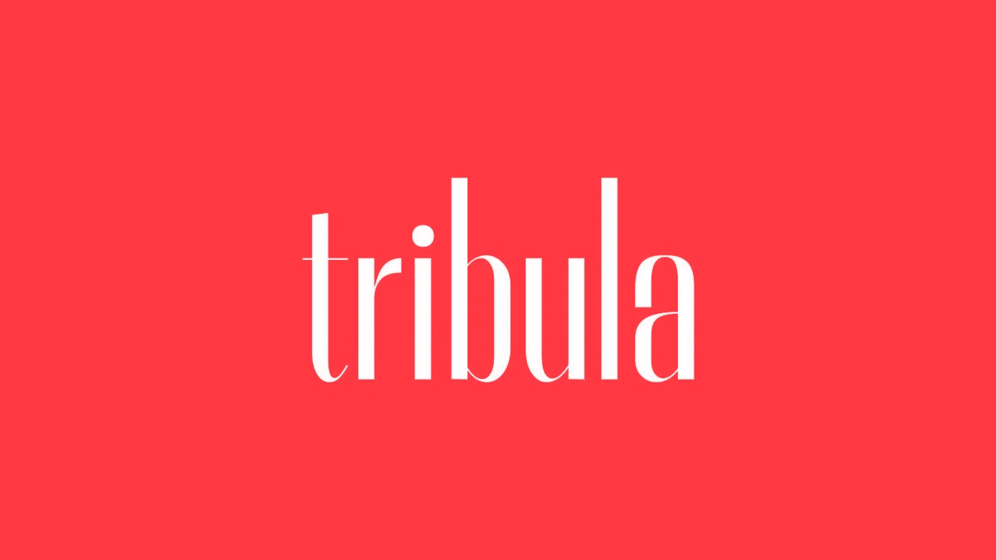
At its centre is the wordmark: tribula in lower case, in a tall, narrow typeface with full stems and hairline details. It lives on a solid coral red, in white or in black. The rest speaks two languages, like the kitchen: bold, squared Japanese titles with the Italian names in script.
On the 2025 menu the red became a weave of dense lines, behind the logo and behind every section header. A few elements, used consistently: the wordmark, the red and the two languages were enough to hold sushi and seafood together in a single image.
The menu
Lettering
Wordmark
Start a project
Tell Studio Cosmos what you are making, for whom and by when. The form asks for your name, your email and a project brief; everything else is optional.